Color is everywhere! In our clothes, on our phone, in the morning newspaper, we are surrounded by color. We don’t live in a black and white world, and our advertisements don’t have to either! When thinking about advertising in either print or online, it’s very helpful to know the difference between the two most common color processes. This knowledge comes in handy when we want our company’s branding to stay the same across multiple different medias.
CMYK and RGB are the two standards in color definition and processing. A graphic designer designing for print, like myself, is more familiar with using CMYK, whereas someone who spends their day creating advertisements for screen, like those massive LED billboards on Times Square, would be more familiar with using RGB. Why does knowing this difference matter? And why should it be something you learn? Let me explain.
CMYK – Cyan, Magenta, Yellow, Key (Black)

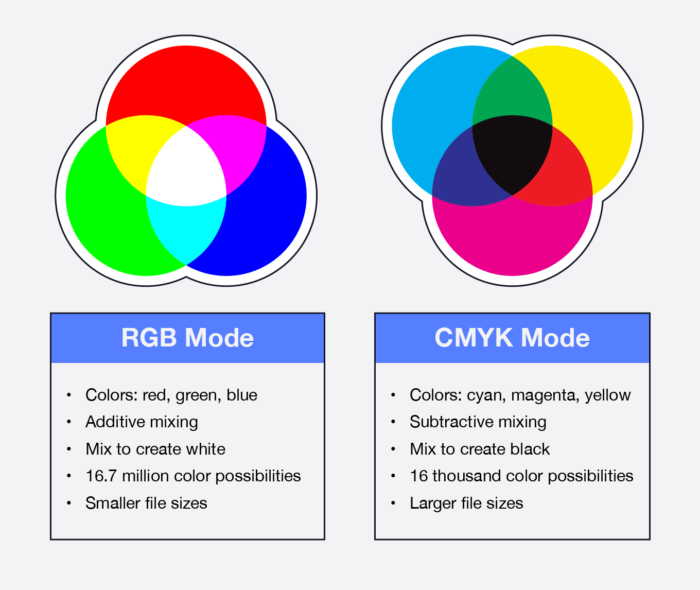
CMYK, also known as process color or four color, is a color model used in printing. Cyan, Magenta, Yellow and Key (black) are the four colors used in this process. They are mixed in different levels to create the desired color, using inks or toners, which are deposited onto the paper and either left to dry or set with heat, respectively. It is a subtractive process, meaning the less color that is added, the lighter or less vibrant the color will be.
For example, if I wanted to make red, the color code is 0/100/100/0, meaning 0% Cyan, 100% Magenta, 100% Yellow, and 0% Black. CMYK has around 16,000 color possibilities, each with their own unique color code.
Black is created using all three colors, cyan, magenta, and yellow, called Rich Black, OR using just the key tone (black). The difference between these two blacks can be stark, depending on the paper being used and the design itself. Rich black has a tendency to look more brown or rusty, whereas Key Tone black will have no variation in color. Being sure you know which black you are using is crucial for consistency.
And consistency is key when it comes to branding! To assure the highest quality and the truest colors to your original design, you or your designer needs to be sure that the artwork is set in the CMYK color mode in the design program being used. If these colors aren’t set up properly when designing, then the colors you intend versus what is printed may be different.
What are some examples of what will need to be set up in the CMYK Color Mode?
- Brochures
- Business Cards
- Envelopes
- Postcards
- Invitations
- Letterhead
- Logos used for Promotional Items such as cups, t-shirts and bags
You may also notice that the colors on screen will also look different than what is printed. Why is this? Because your screen is another color mode, too!
RGB – Red, Green, Blue

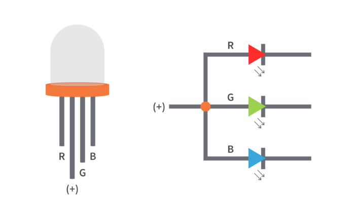
You may be more familiar with RGB than CMYK, even if you aren’t aware of its influence. All of our screens we see every day use the RGB color process. RGB uses light to create colors, pixel-sized LED’s in Red, Green and Blue. It’s an additive process, adding the colors together to change the tones and hues. To create white, all three colors are on, which gives the effect of white. To create black, the light is merely shut off, the absence of color.
RGB has around 16.7 million color possibilities, which is a massive number compared to CMYK. RGB uses Hex codes for the color recipe. For example, Red is hex #FF0000, also written as 255/0/0. So, 225 red, 0 green and 0 blue. This red is very vibrant, and only achievable in the RGB color space.
Because RGB’s creation relies on pixels and light, it is used when creating images that will be displayed on a screen. For Example:
- Websites
- Blog Posts
- Emails
- E-Statements
- Social Media Posts
- Electronic Billboards
This also means that colors left in the RGB color mode, when printed, will not result in the same outcome. RGB and CMYK do not convert well into each other, and it is better to make sure you convert the processes and adjust your colors accordingly before printing.
Knowing the differences between these two color-processes can really make or break the outcome of your design. It’s important to use the correct color settings when designing for print or for the screen!
Are you still struggling in the RBG or CMYK color space? Let us help you! Contact one of our Sales Executives today!


